Just Air Compressors: Building a Brand
From Scratch
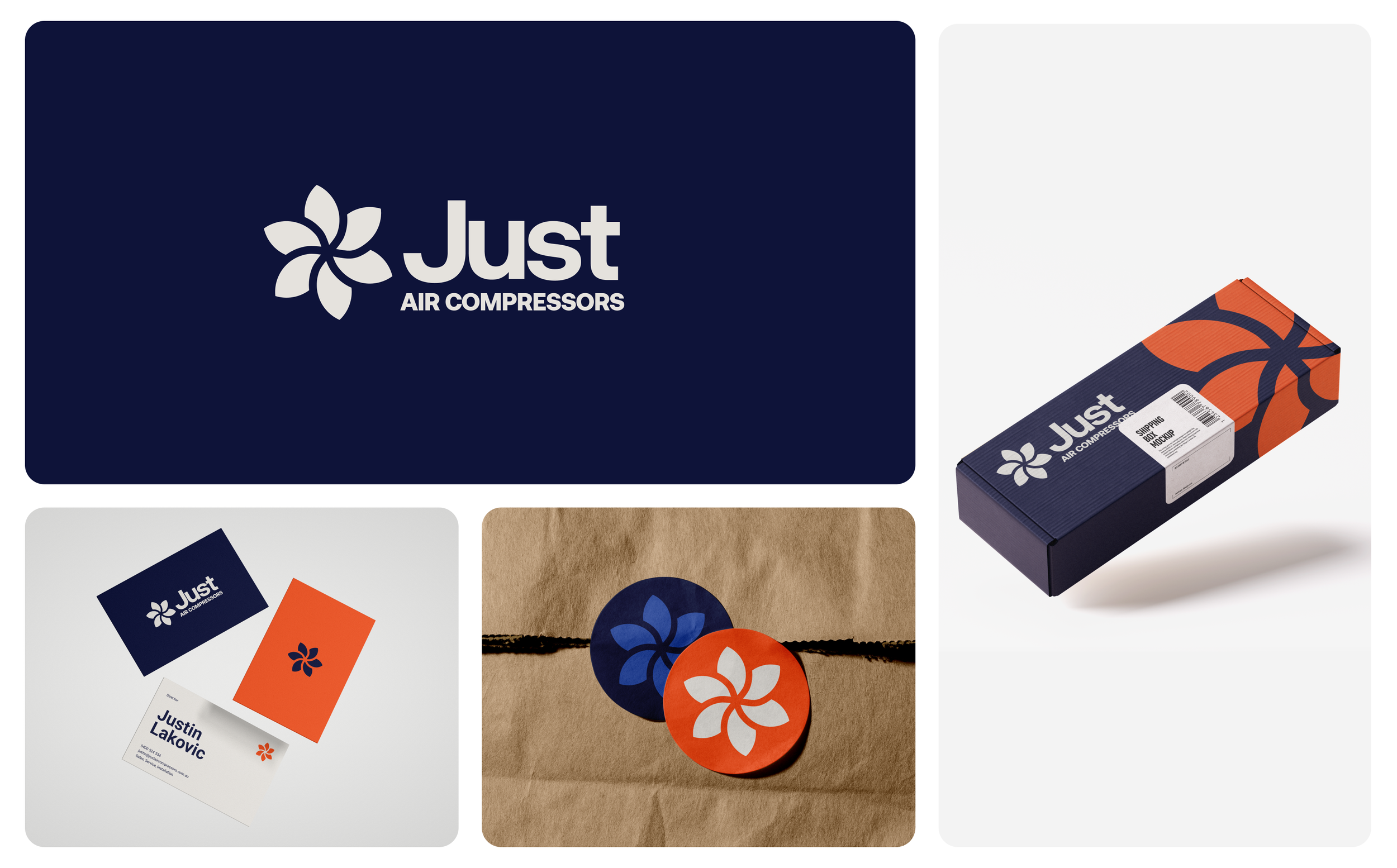
Justin was launching a new air compressor sales, service and installation business with no existing brand to work from, and a category where every competitor leans on the same navy, dated look. He needed something that felt dependable and established from day one, but stood apart the moment a plant manager saw it on a business card or a service sticker.
A mark rooted in the machine
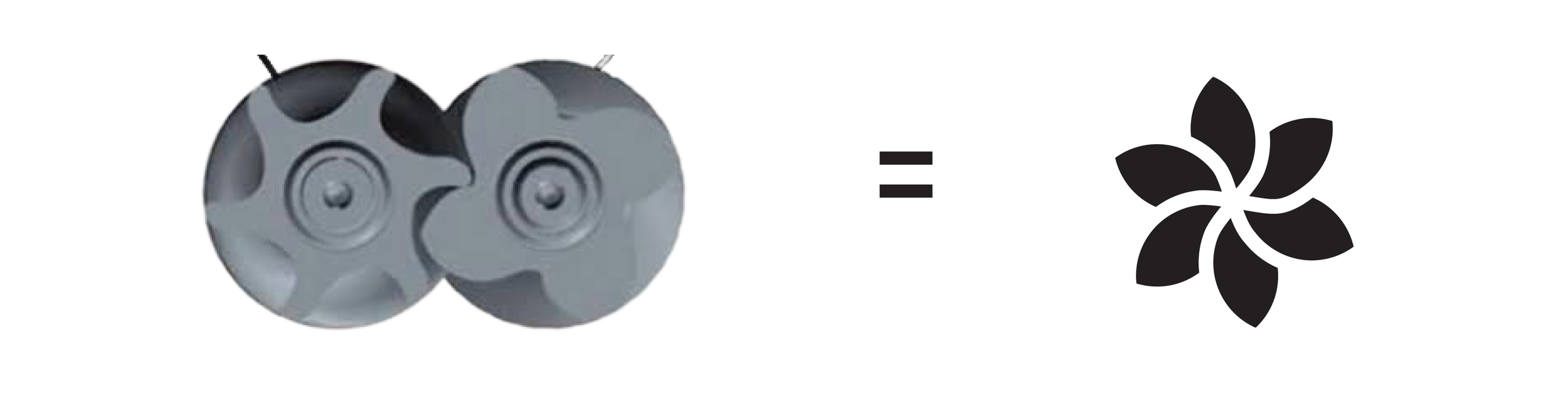
Rather than illustrate a compressor literally, we built the brandmark from the twin-screw air end at the heart of the equipment. Two interlocking rotors, repeated around a centre point, become a six-bladed emblem, modern and abstract, but still unmistakably industrial.
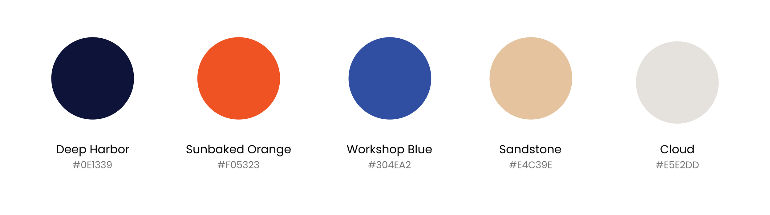
Colour did the rest of the differentiating. Instead of the navy every competitor defaults to, the palette leads with a warm Sunbaked Orange against a near-black Deep Harbor, giving the brand shelf presence in a category that all looks the same.
A system built for the field
The mark had to work as hard on a 150x100mm service sticker written on in permanent marker as it did on a business card or a shipping box. A clean combination mark, a tight colour system, and a simple, rounded-corner card gave Justin a brand that reads as confident and current from his very first job.